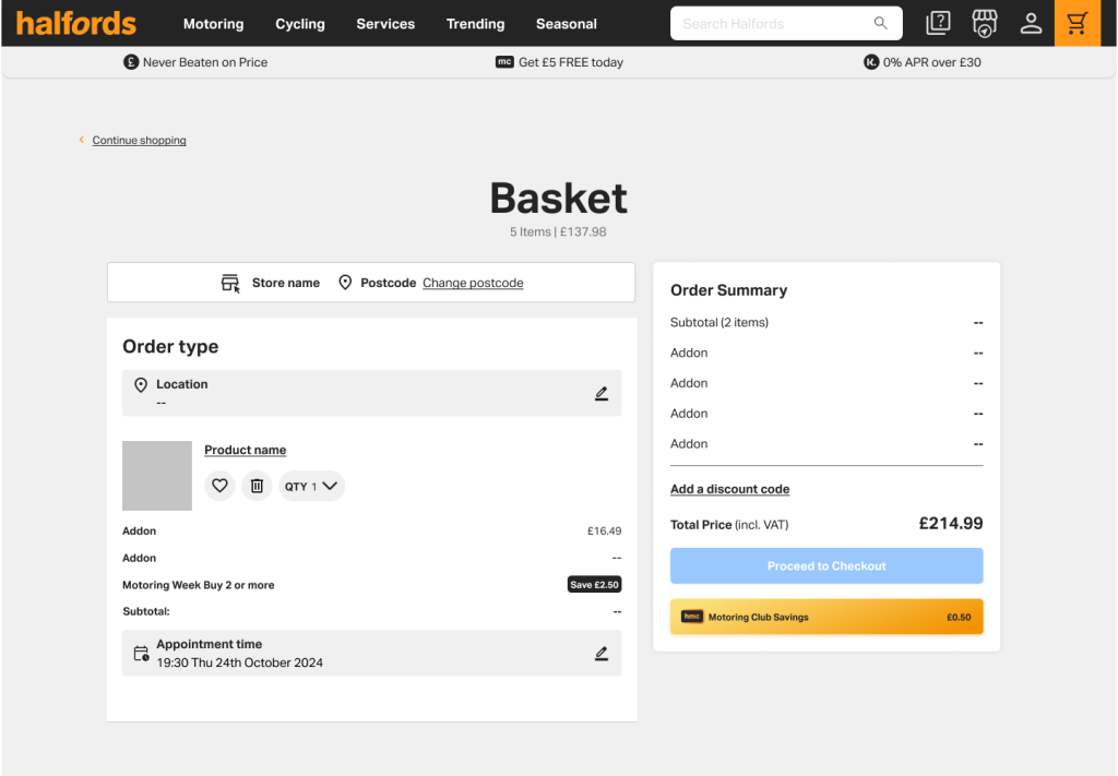
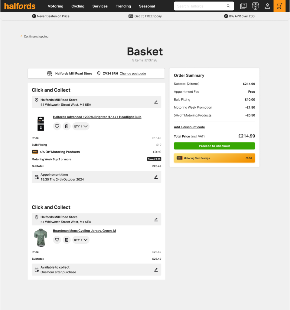
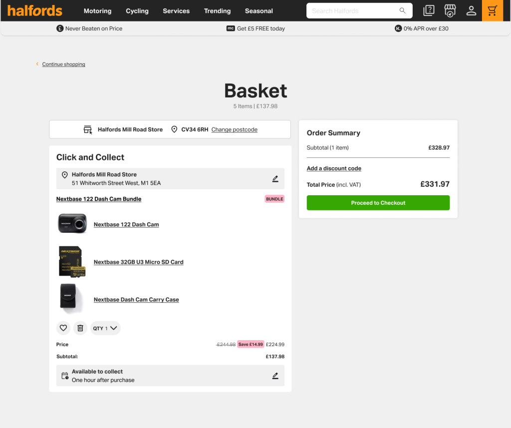
As part of optimisation key steps in the purchase journey, I got involved in redesign the basket experience for customers at Halfords
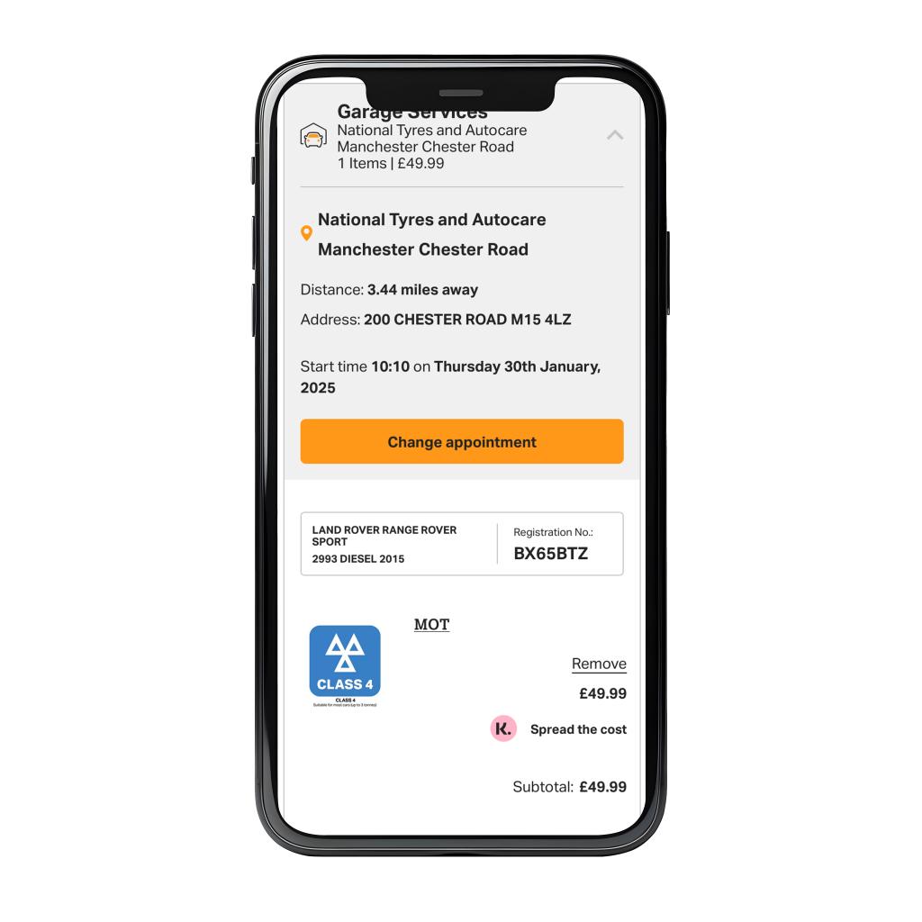
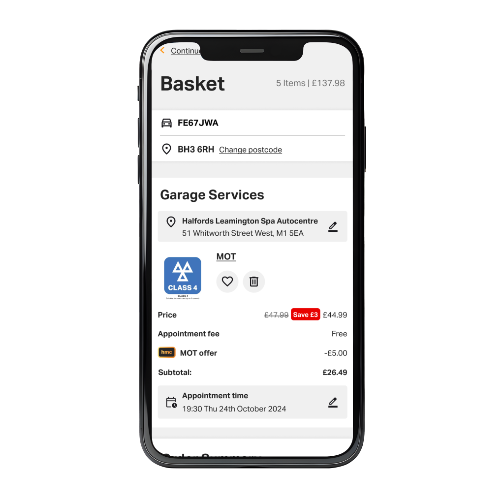
The solution:
A redesign for the main elements address issues I and the team in collaboration analysed.
Research & Insights:
Contentsquare (Analytics on conversion)
I looked into some Contentsquare replay session, by targeting the part in the funnel journey where users need to go through.
Medallia: (feedback from post purchase surveys)
I searched for themes regarding checkout, frustration with payments and lack of clarity with the summary, some feedback was left in he last 30 days
Competitive Analysis:
Luckily for me, it was easy to look for some interesting design patterns on a checkout page, given how popular commerce websites in the same space exists on the Internet, I found some clothing brands to be quite user friendly , one theme that was very common , was to find your items in one column , and the summary on the other, with space to user options , (coupons, gift cards, home/collect in store delivery etc…)
Design opportunities:
Visual hierarchy
Product names, titles, and some text to denote key actions (delete, remove) were not in close proximity to the context item
Clutter
Many promotions and labels floating around the page were regard as clutter by users, we needed to prioritise and understand what was important for users
Layout
A more compact layout where times, and key information is easier to read
Information summary
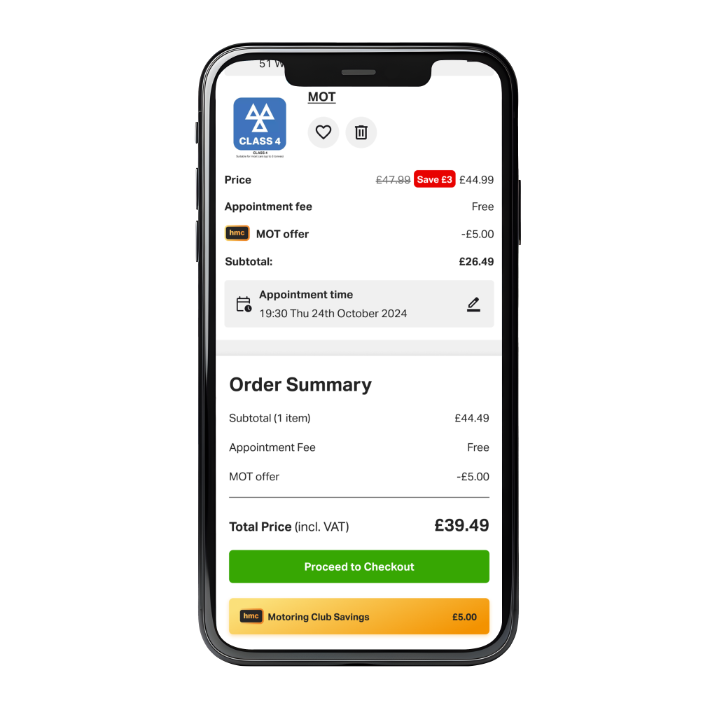
The summary block where the total and extras are displayed was not entirely clear to users.
Key Features for redesign:
- Compact layout with more room and space
- Clear text and font hierarchy
- Better iconography for call to actions such, add, remove, and edit
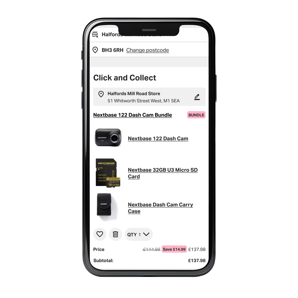
- Overall consistency in the card element for each item in he basket
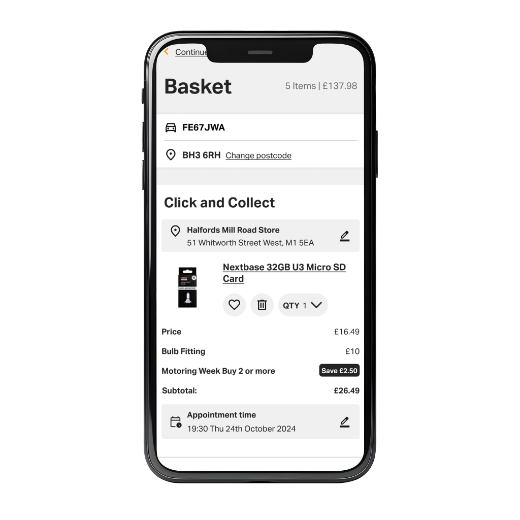
- Important information easily seen (Vehicle number, postcode, times and location for click and collect)
User Testing & Feedback
Usability Testing:
For testing I used Userzoom, the goal for the test was to see if participants would manage to get to the confirmation page easily, given a variety of mixed scenarios, or mixed basket contents.
I set up a usability study where you can watch participants go through your prototype , and listen to feedback as they go along.
Halfords have a few options for their customers, such as click and collect vs home delivery and also some users may want to include gift cards or discounts before paying.
It was reported during the usability test that users expect the order summary to be clear and visible with any discounts or coupons applied.
Outcomes:
- Participants reported to be a straightforward experience
- Feedback was positive regarding the tabbed approached
- Users like the summary concept for mobile
- Some participants reported inline validation made the process quicker
Some of the work:
These are some screens showing the steps a user will see after adding a product to their basket, as it is often seen in many e-commerce websites, the user will need to input their details before payment, select a few key elements on the product and choose their delivery method.
Screenshots for mobile view:

Screenshots for desktop view:
