The project
I was tasked to redesign the current checkout flow at Halfords, from the statistics provided by our UX research tools (GA analytics, Contentsquare and other data), we could see users were experiencing some issues when navigating the current interface before they reach the payment step.
I set up a few calls with the wider team and relevant stakeholders to understand business objectives, current pain points and what long term vision we are looking for.
The solution:
A redesign for the checkout journey to address known issues stopping users from checking out their orders
Also a a prototype for testing
Research & Insights:
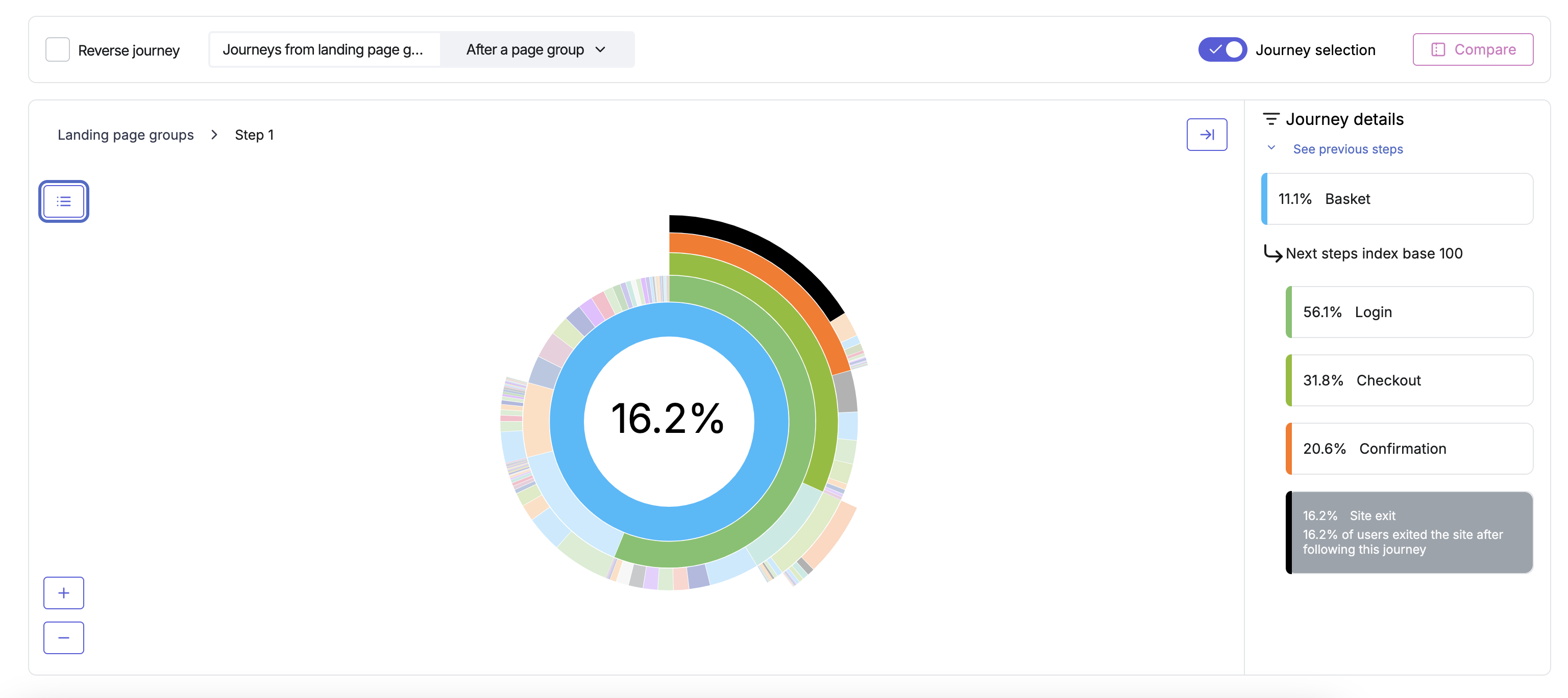
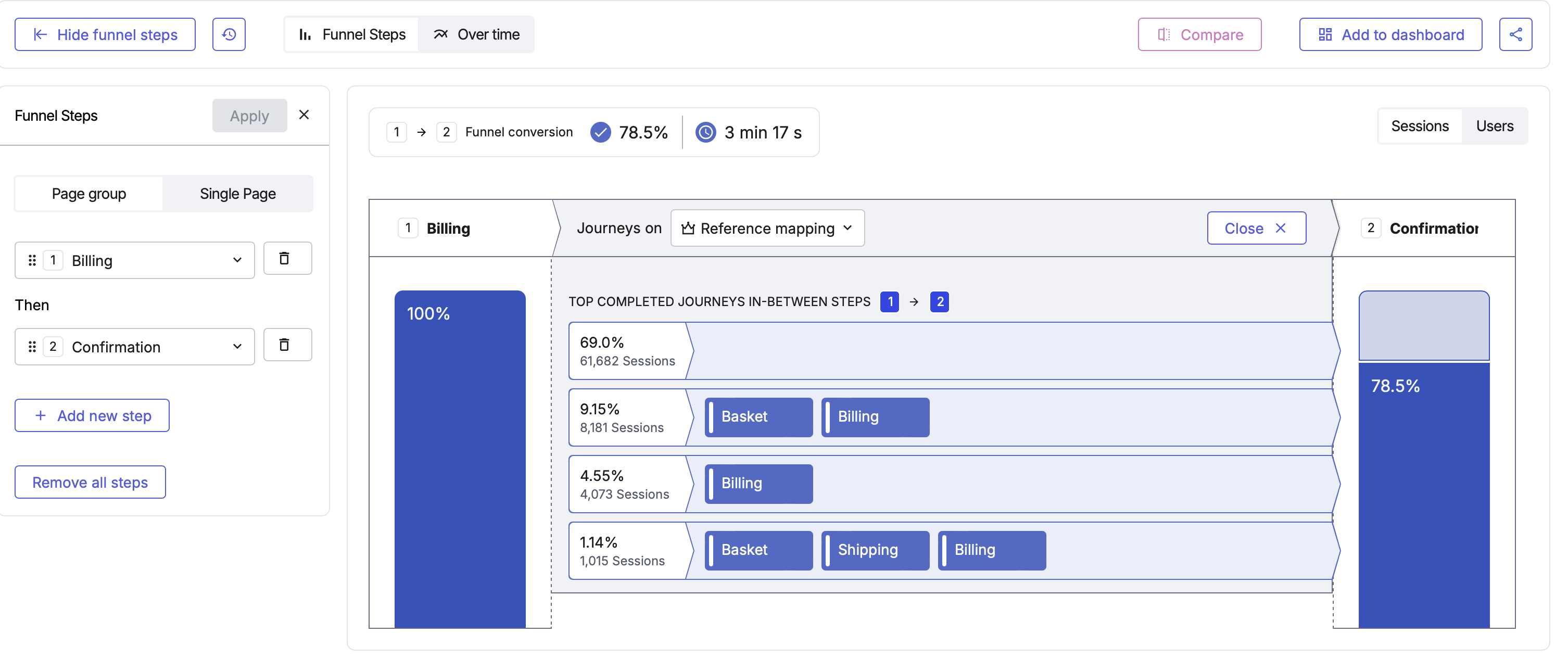
Contentsquare (Analytics on conversion)
I looked into some Contentsquare replay session, by targeting the part in the funnel journey where users need to go through.
Medallia: (feedback from post purchase surveys)
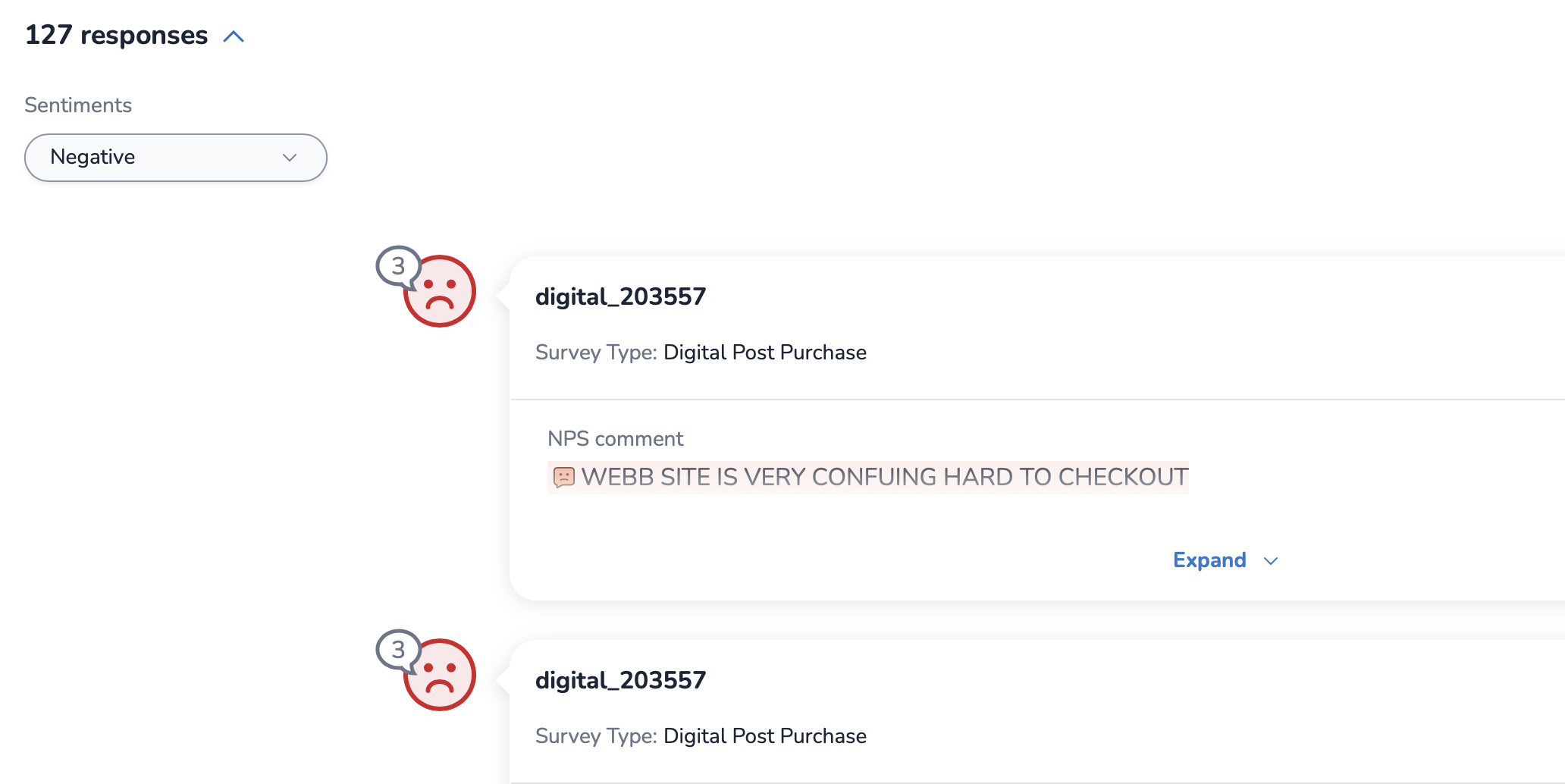
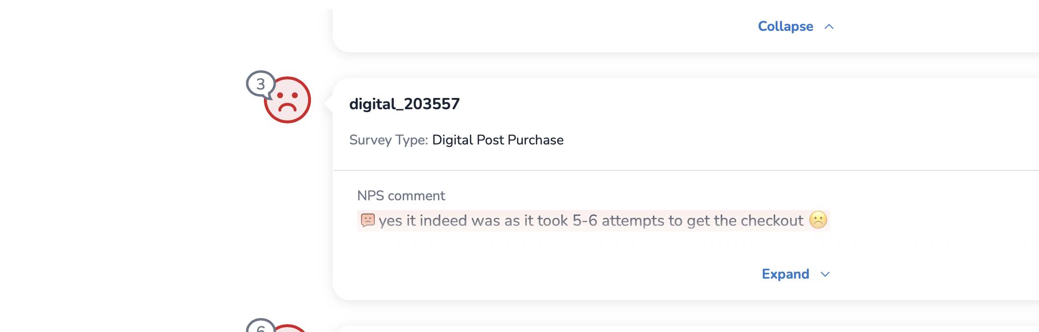
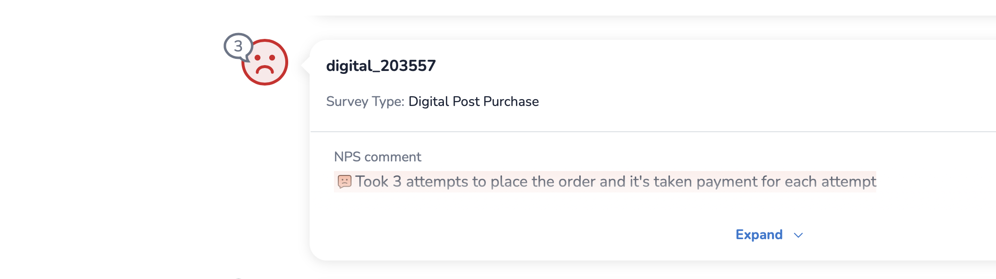
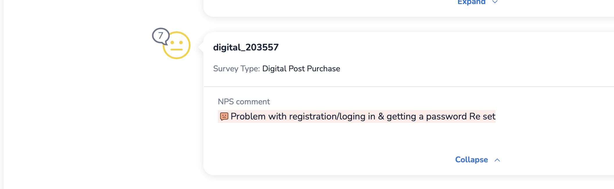
I searched for themes regarding checkout, frustration with payments and lack of clarity with the summary, some feedback was left in the last 30 days.
What is out there Analysis:
Examples I found:
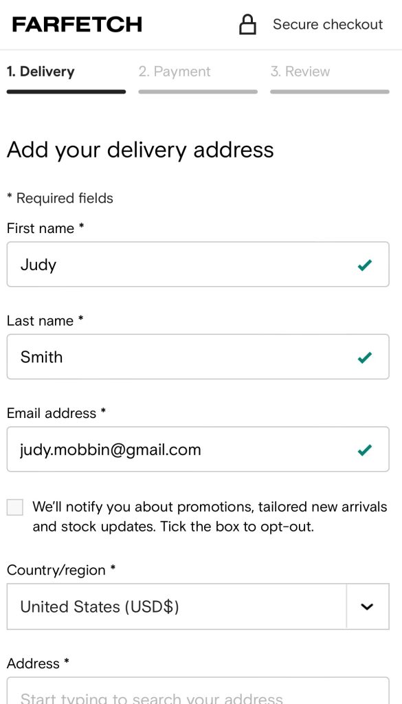
Farfetch
Inline validation. When filling a form it is imperative to provide a visual feedback to the user that the value input is right, as you fill in the inputs it validates the format so you don’t see any errors at the end of the blow on the ‘submit’ stage.
This will solve the problem we have as well.
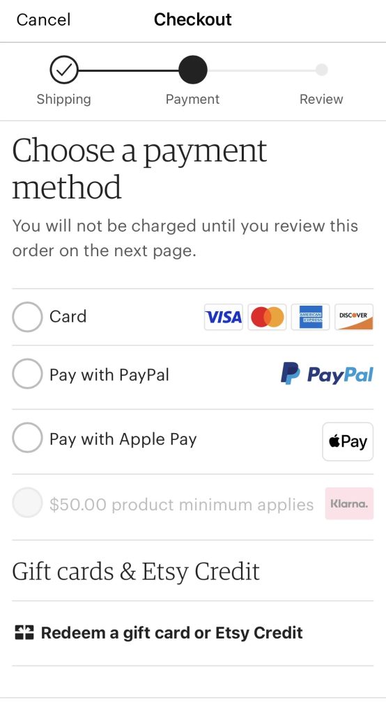
Paypal checkout shows a clear progress bar at the top
As the user completes each stage, (details, payment, confirmation) , the bar updates.
This is a common themes in many websites.
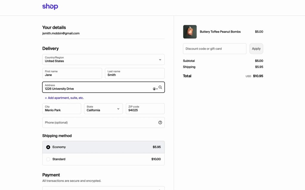
Shop
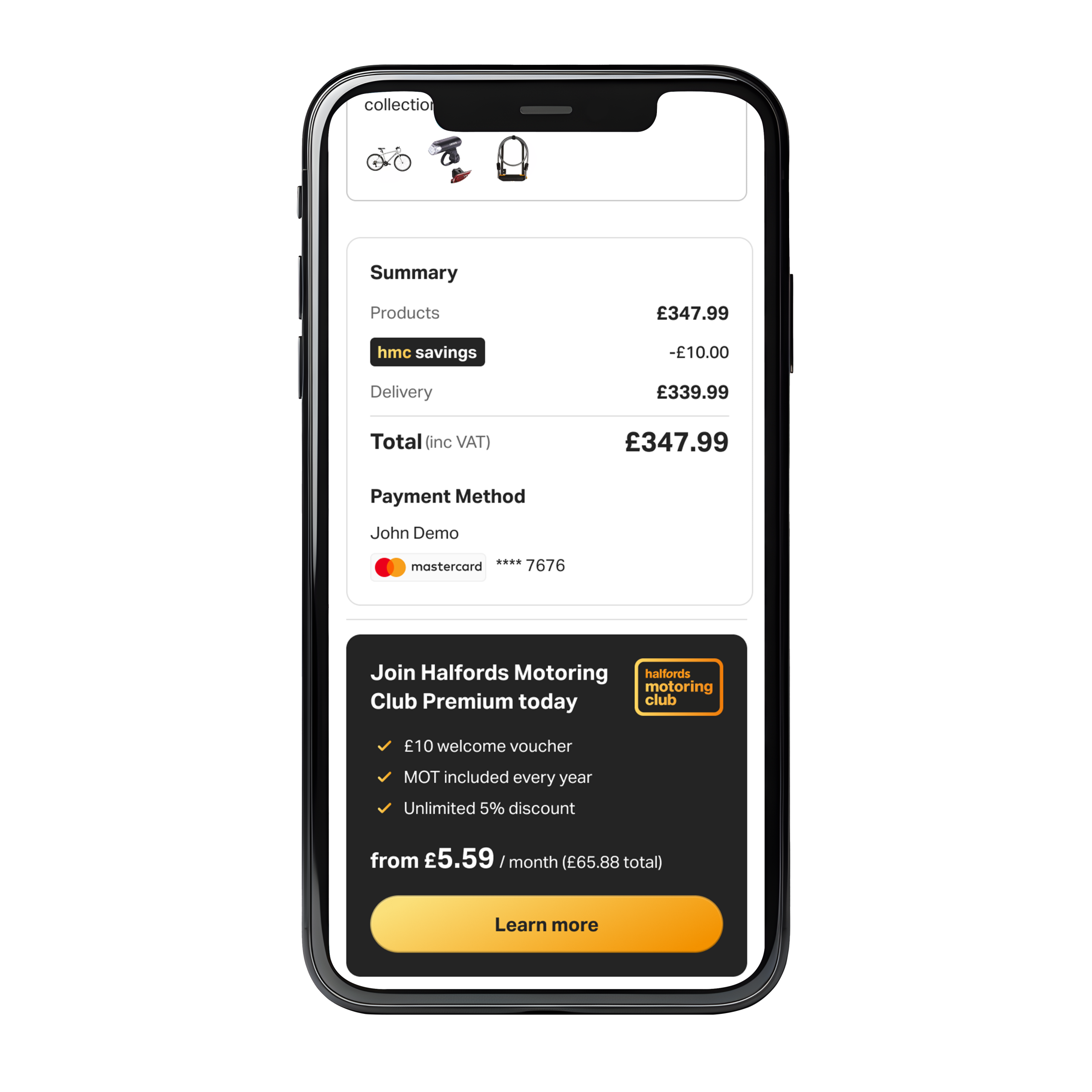
The summary for the items in the basket is placed on the right side so users can see any additional fees, a breakdown for all the summary, apply coupons or discounts.
Another theme commonly found across.
Key themes found across many websites:
- Progress tabs for each step
- A summary column on the left or right side (desktop view) while a summary below on the mobile view
- Inputs being validated following the form flow
Design opportunities:
- Difficulty to fill the initial details form:
- Unclear info in the summary:
- Login and Signup issues:
- Overall cleaner layout
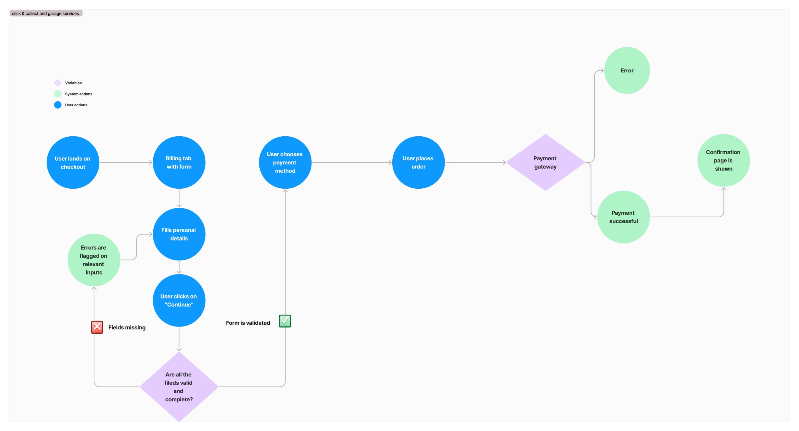
Proposed user flow
User Testing & Feedback
Usability Testing:
For testing I used Userzoom, the goal for the test was to see if participants would manage to get to the confirmation page easily, given a variety of mixed scenarios, or mixed basket contents.
Outcomes:
- Participants reported to be a straightforward experience
- Feedback was positive regarding the tabbed approached
- Users like the summary concept for mobile
- Some participants reported inline validation made the process quicker
Some of the work:
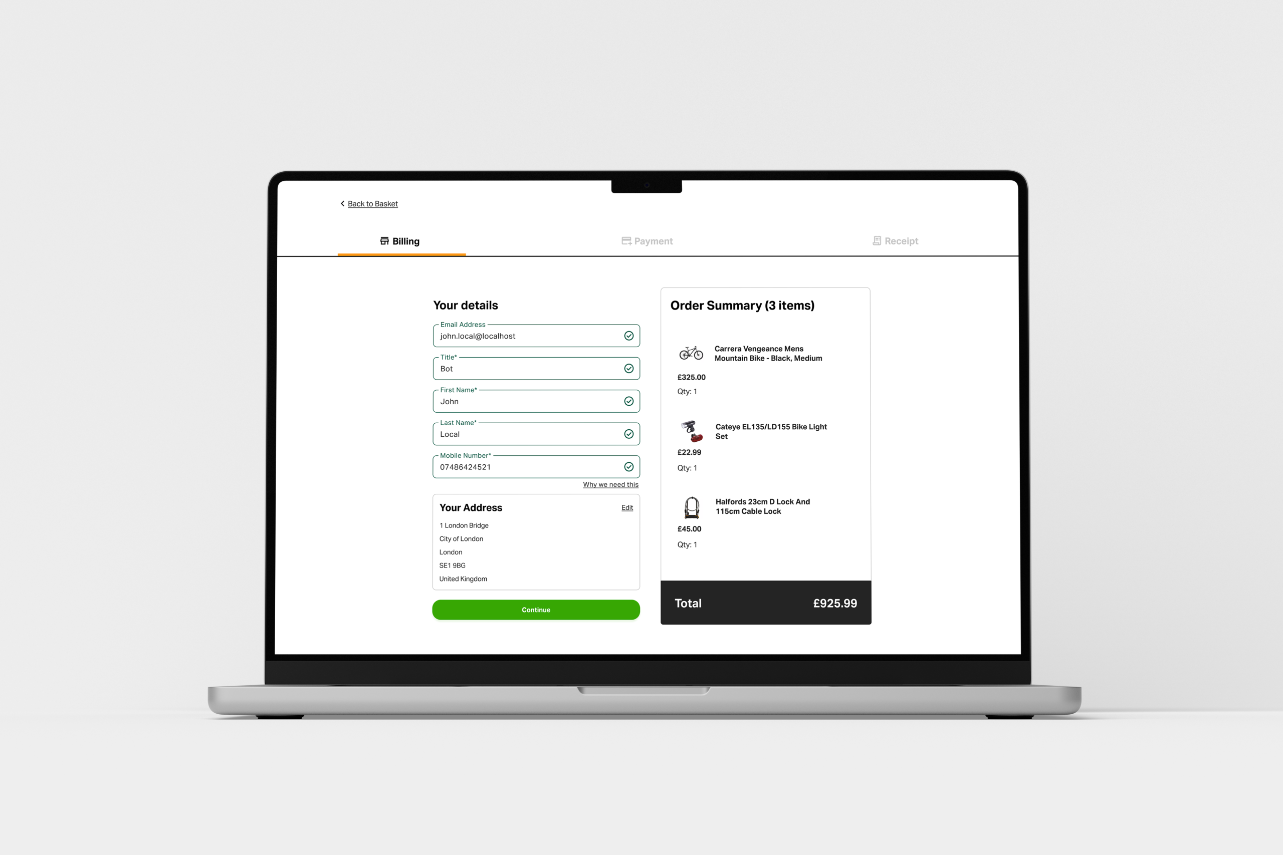
These are some screens showing the steps a user will see after adding a product to their basket, as it is often seen in many e-commerce websites, the user will need to input their details before payment, select a few key elements on the product and choose their delivery method.
Screenshots for mobile:
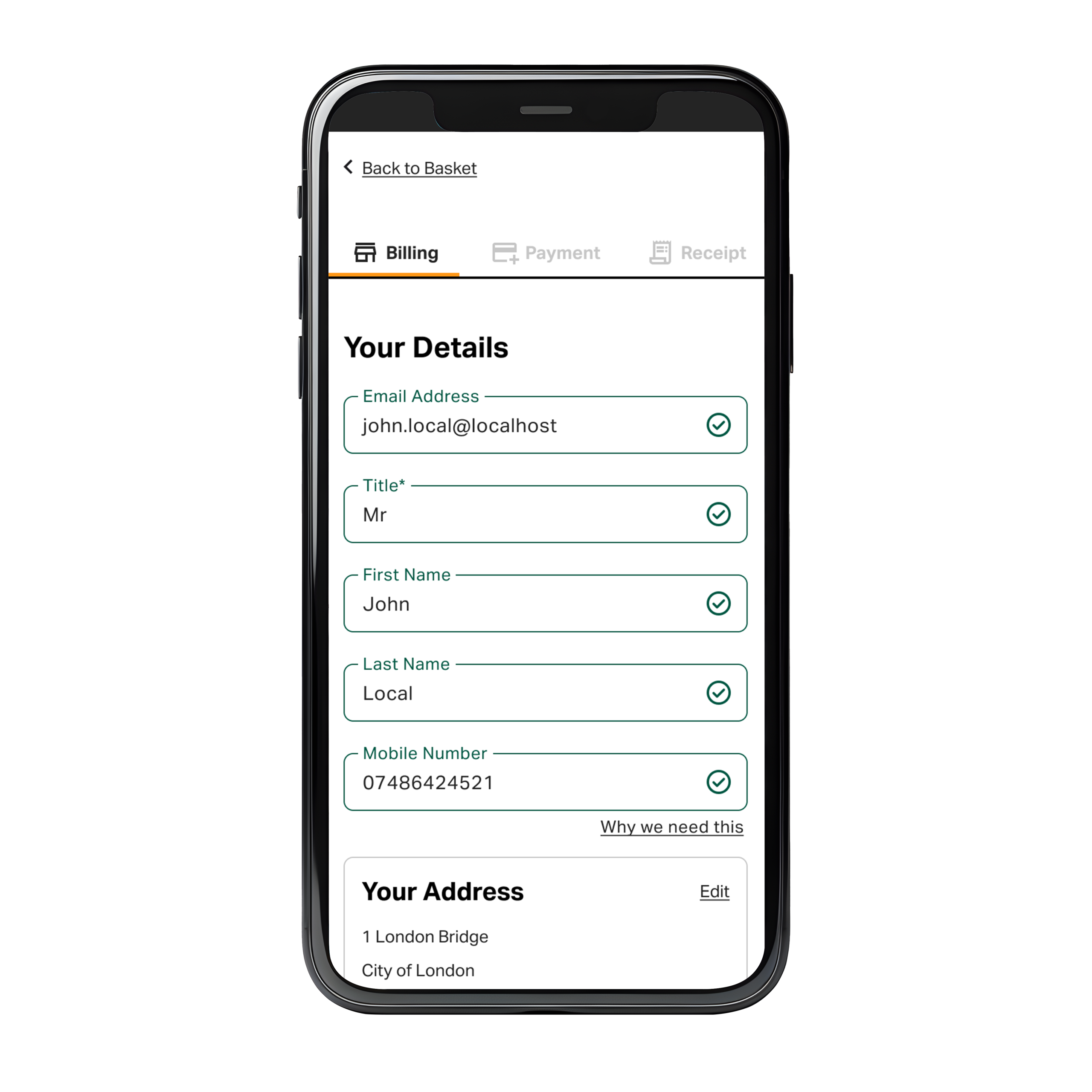
Inline validation on inputs, as the user fills in each input, a pattern is checked against to make sure the right format is applied so that at the end of the flow, there is no errors to fill in.
The green icon indicates the input is valid to proceed.
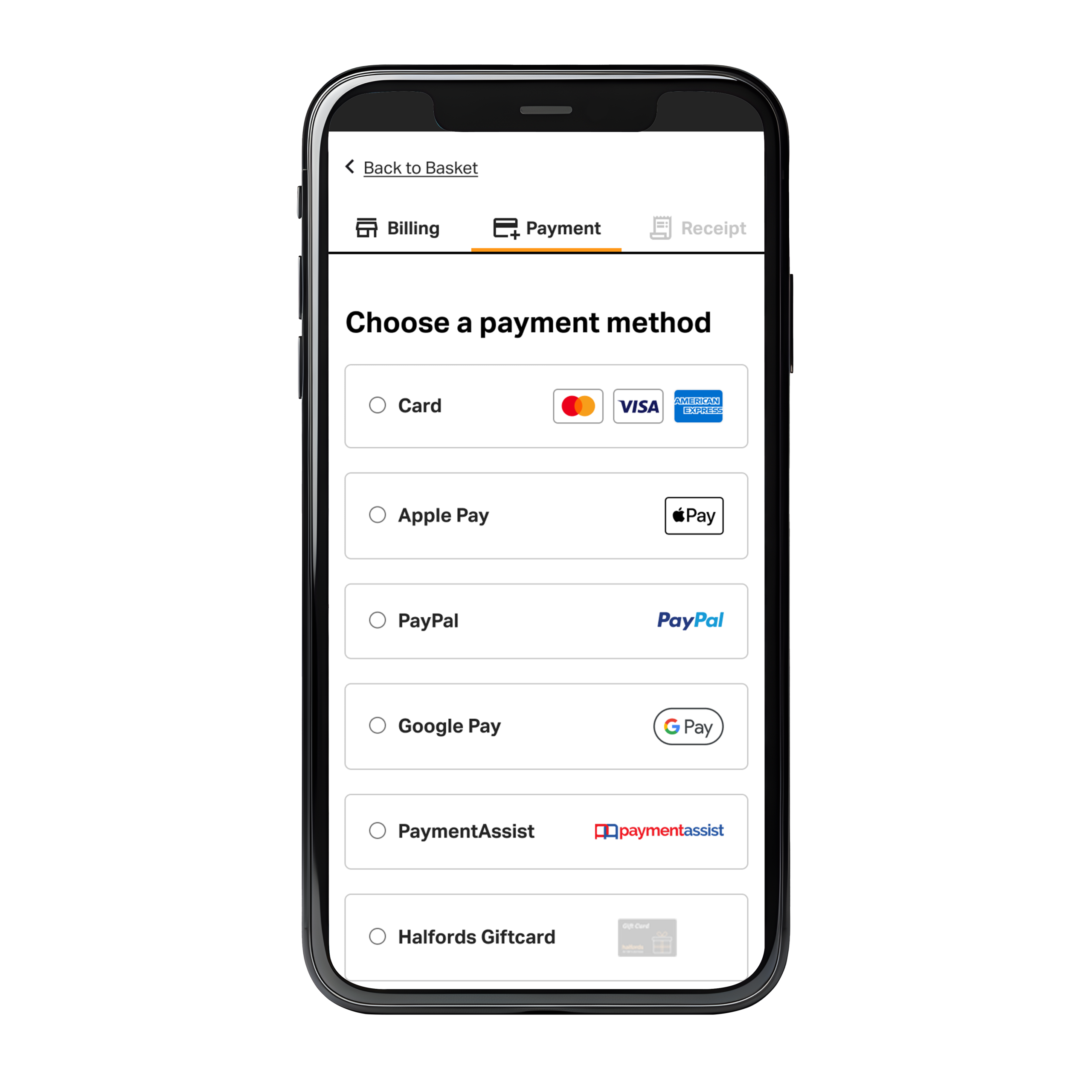
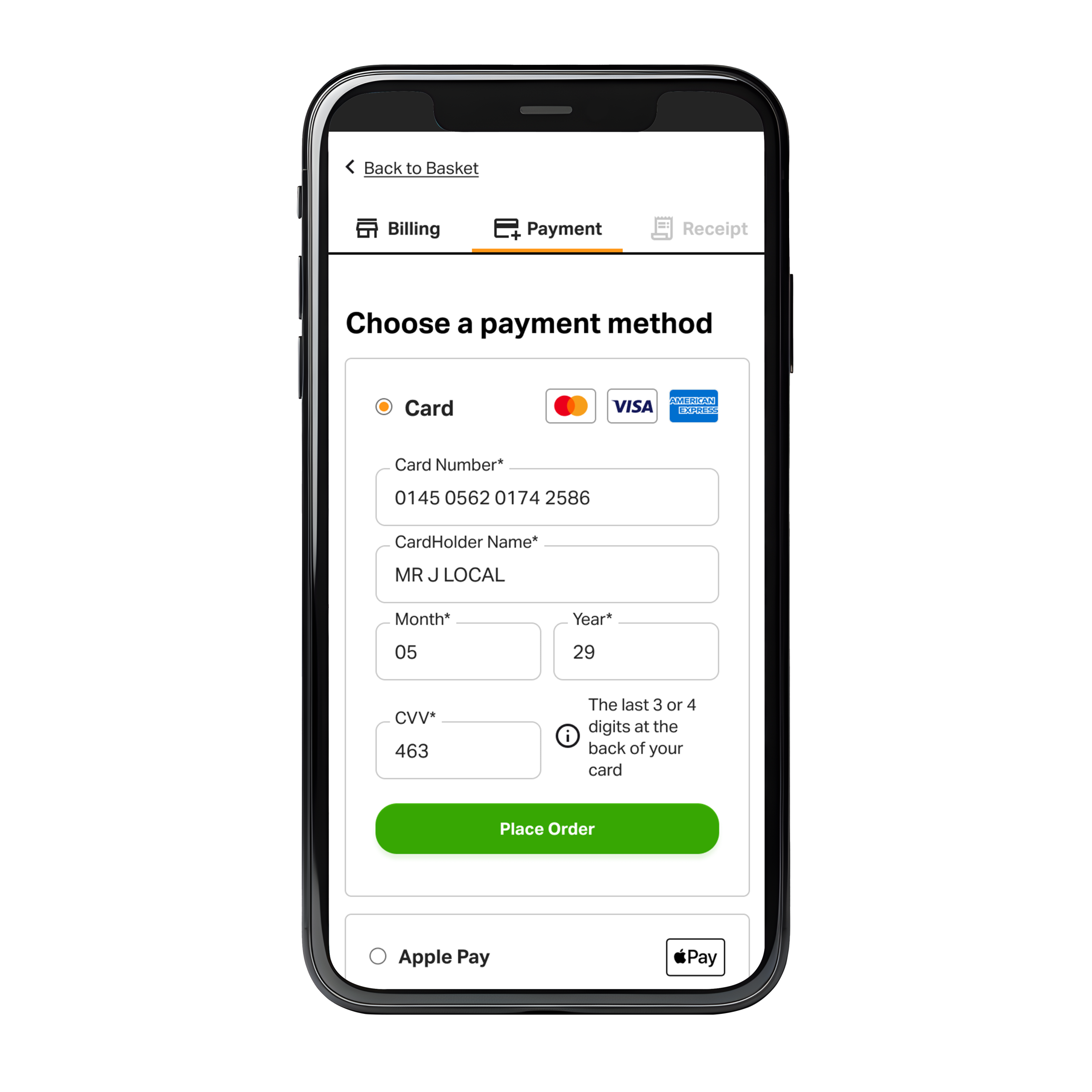
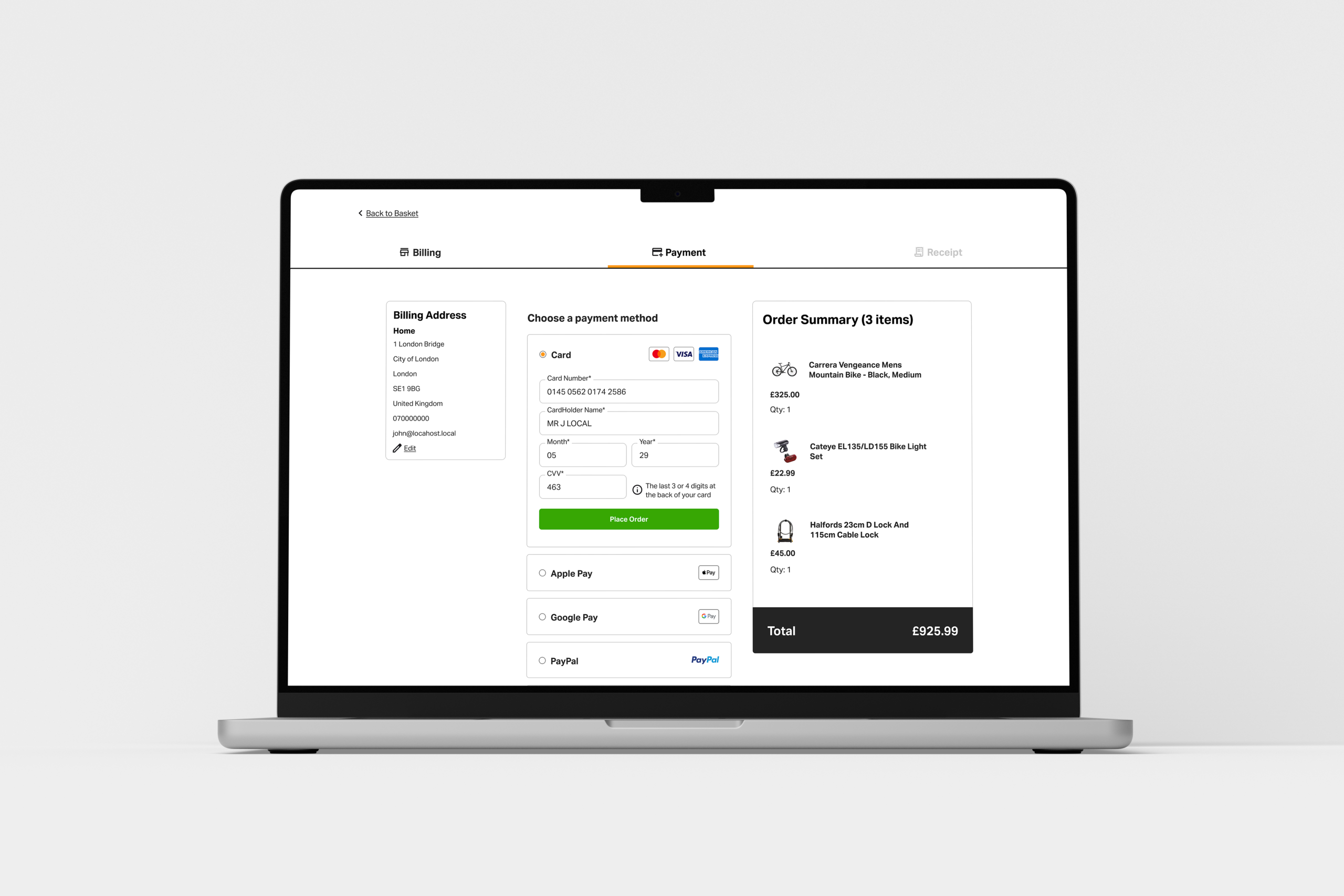
At the payment stage, several payment options are presented, you can only choose one so radio buttons seem to be the most appropriate control.
Billing address can also be checked before payment, as it will be used to validate the transaction against the bank details.
Details in
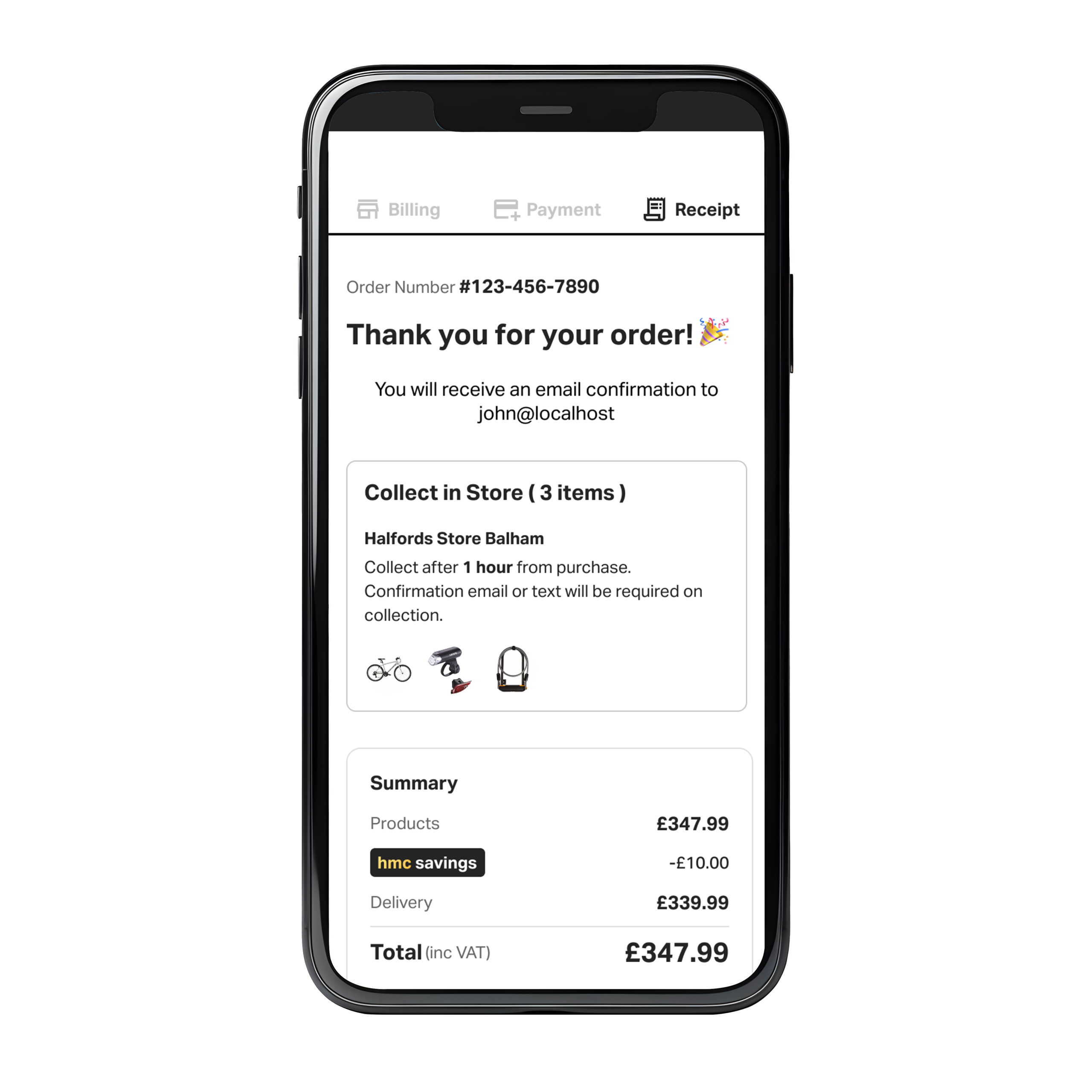
Order is confirmed
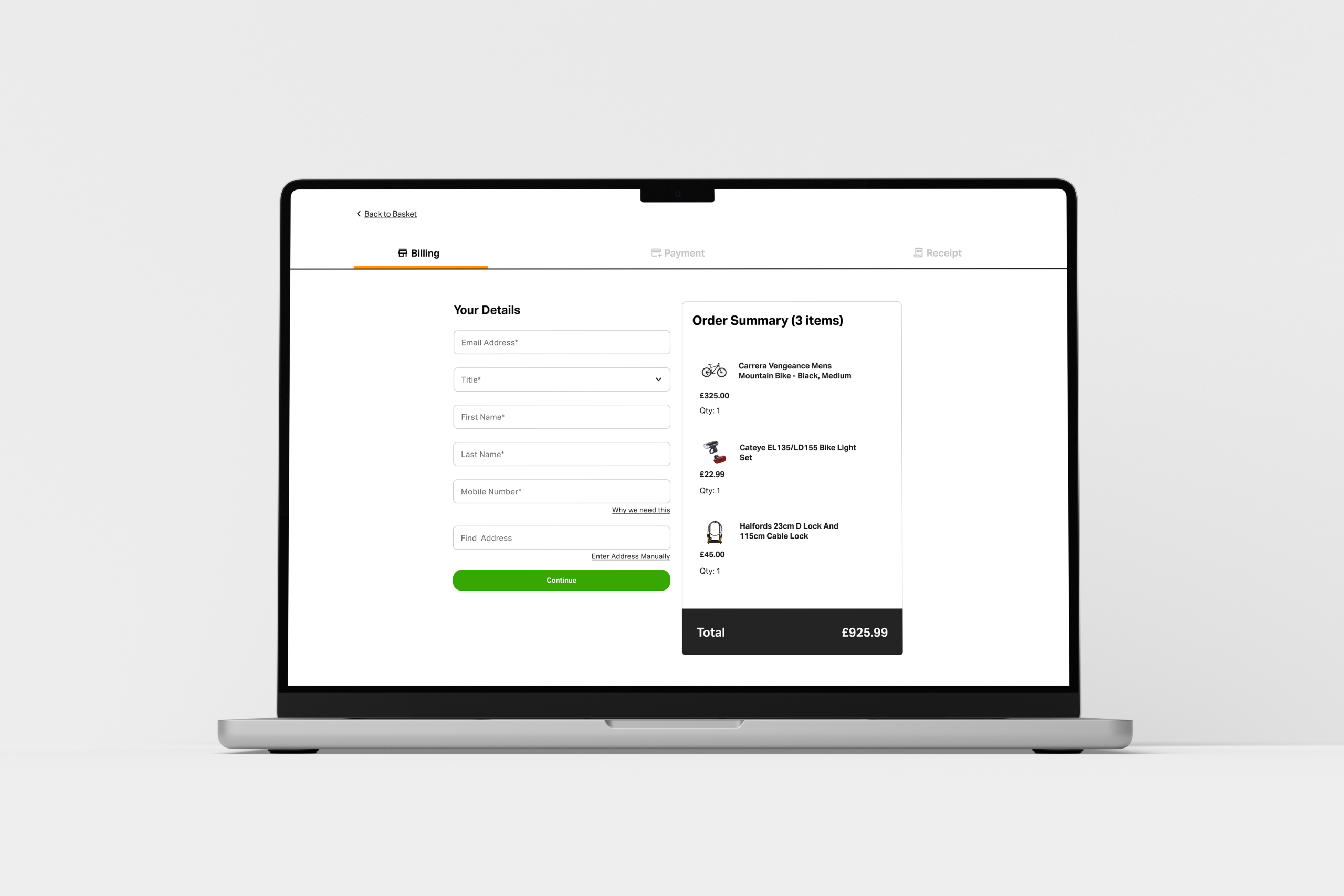
Screenshots for desktop:
Team feedback and share
A common practice in my process is to share with the rest of the team for a round of internal feedback in case I have missed important details outside my sphere of competence.
Conclusion
Users reported positive feedback regarding the experience when looking for the summary items
an A/B test was launched with Webtrends on the live site during 30 days, it increased conversion significantly by around 36% percent.
Overall the project was a learning experience like many others.