The project
Design an end-to-end process to sign up to a popular subscription plan Halfords Motoring Club, for loyalty customers
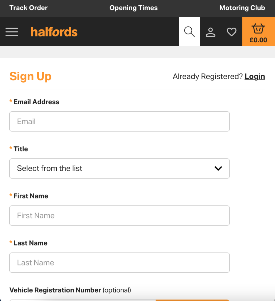
Current sign up entry point
Long form for users to sign up to the loyalty program, currently there were a few blocks identified, journey was split, form was long and error prone
Current user pain points
- Centralized entry point difficult to find
- Form input prone to errors
- Login/Sign up flow
- Split journey leading to different users expectations
- Legacy backend issues
The solution:
An easy streamlined sign up journey where a user can create an account while purchasing a Motoring Club subscription which address UX blocks and matches the business acquisition strategy
Stakeholders interview
I setup a Miro board for the team to add relevant materials, I also set up an initial call with the product owner, business analysts, developers to understand the business requirements and long term vision, on my side I will find a compromise between the business goals with this project and the best user experience.
Research & Insights:
Userzoom (surveys)
I set up a few surveys to understand users needs and expectations regarding first impression of our pricing plans , and overall sentiment towards subscriptions plan
Some of questions I asked:
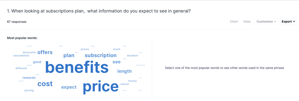
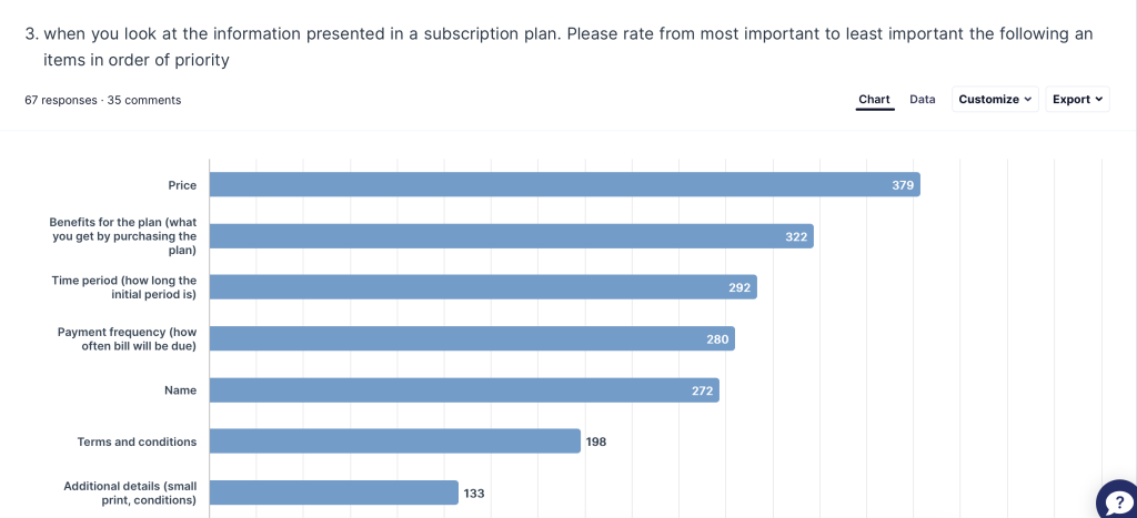
The insights I took from the results allowed to create a design that will align with the users expectations
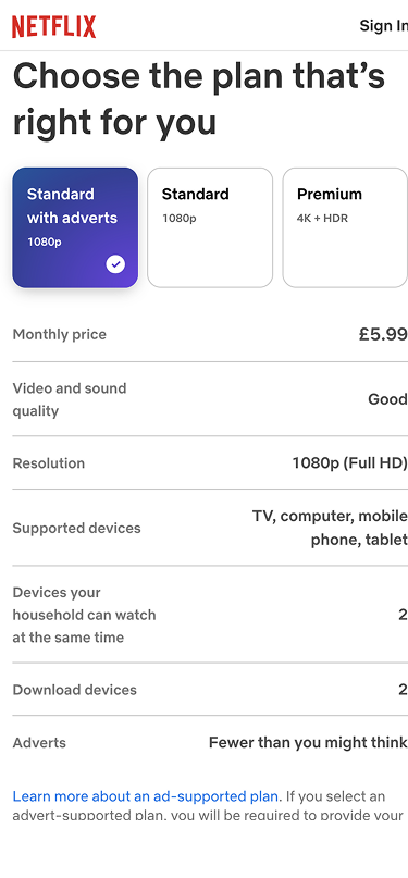
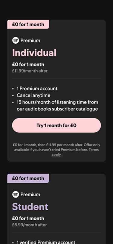
What’s out there analysis
It is a know good practice int he UX world to look for other examples of a similar product to understand users sentiment, needs and expectations , I looked for a well known and analysed key themes
Key themes found across many apps and subscriptions products:
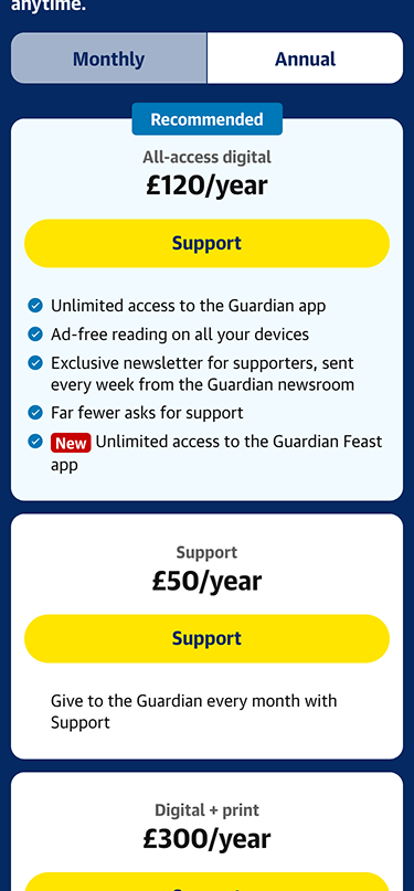
- Promiment call to action at the bottom after the plan benefits
- Price and period clearly shown with the plan name
- Benefits what is included
- Plans are shown often in a linear fashion to compare
The user journey
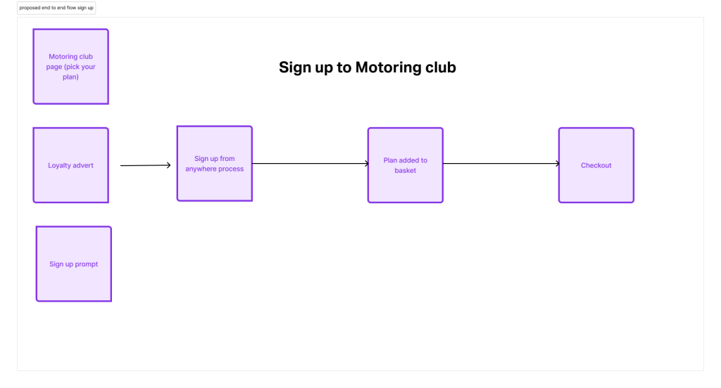
Initial prototype
- Inline validation in fields as the user fills the form.
- Email verification using common OTP (one time password) method
- A prompt placed strategically across the site to sign up for a plan
- A table comparing the free vs the premium option
User Testing & Feedback
Usability Testing:
I set up a usability study to test whether users would complete the task, to sign up to a premium plan and see if they managed to add the plan to their basket, this is ideal , since they would be able to exercise their benefits in the same transaction at the same time of purchasing the plan.
Outcomes:
- Participants reported to be a fast simple experience
- Feedback was noted regarding the comparison interaction when looking at both plans
- The basket notification about subscription added was well received
Screenshots for mobile:
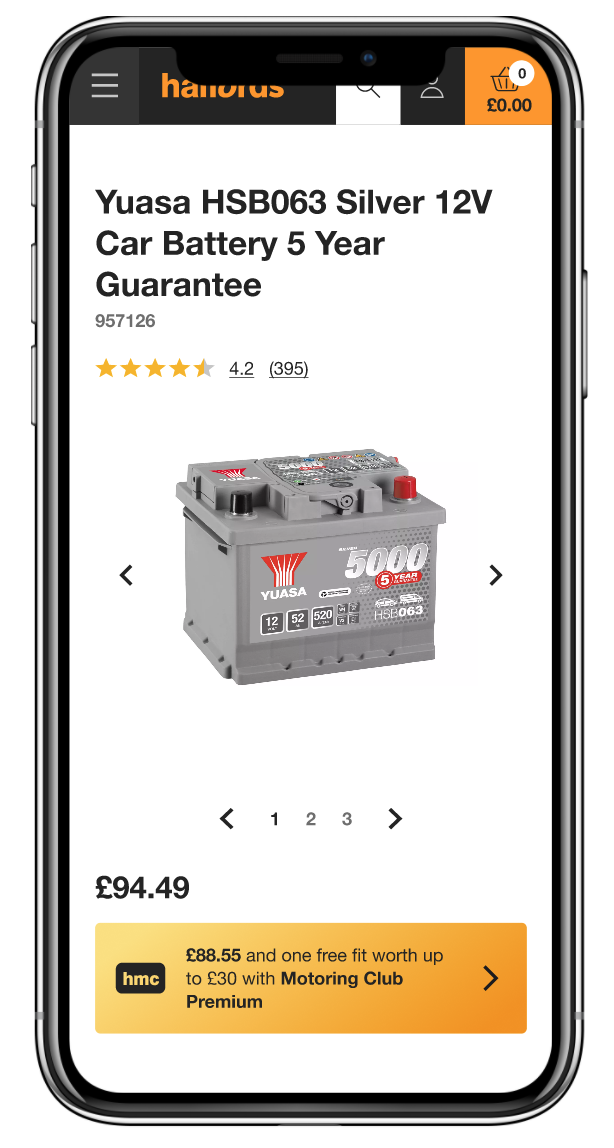
A product landing page where users can sign up for discounts
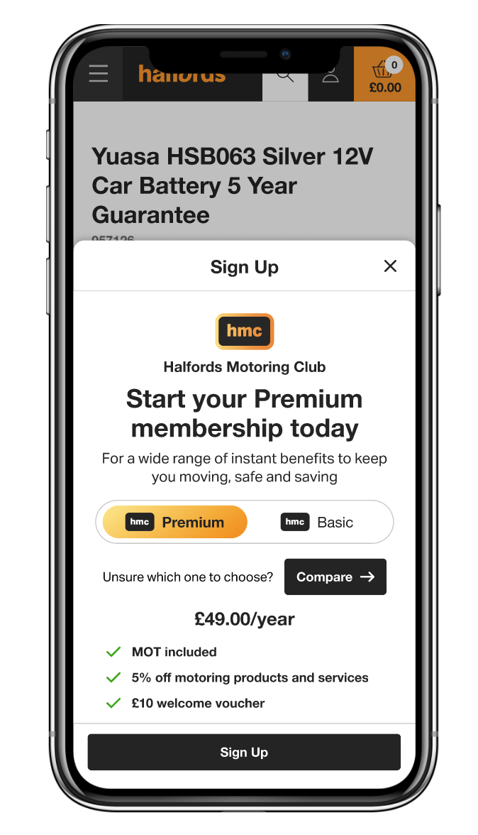
Sign up component showing different plans and options
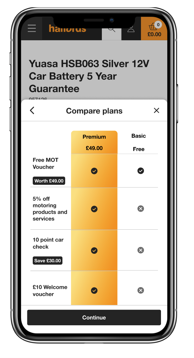
Compare different plans
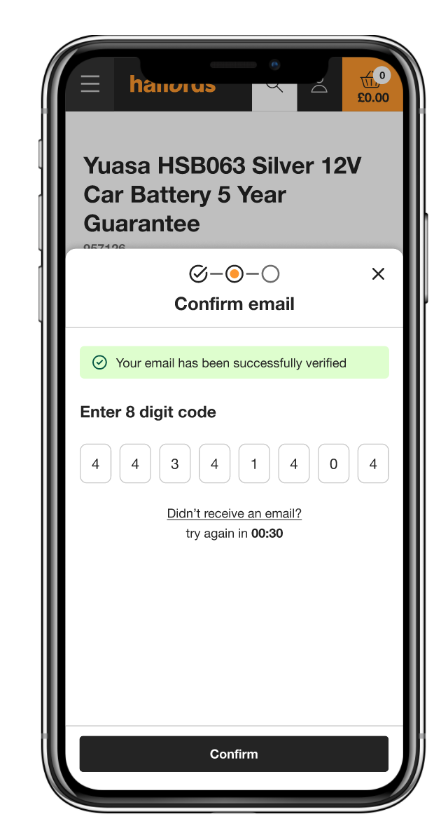
Email verification standard practice
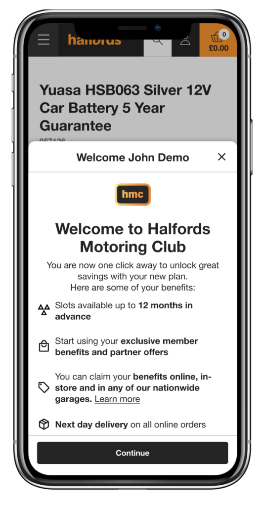
Sign up complete and benefits
Team sharing, user feedback and iterations
After sharing some results from the test and user insights , we define a first MVP to be tried out in the next sprint.
Conclusion
After initial launch we saw an increase in sign ups both for premium and free, customers at Halfords reported good feedback on the benefits offered, particularly the MOT voucher, and really liked the comparison option, they said they found it really easy to see the differences.
Overall it was a good experience to collaborate with different people in the organization , product owners, proposition owners and other stakeholders.
Outcome
A test was implemented in web trends for a certain number of users , the data shared by the internal team showed a significant amount of signups and good feedback overall.